
Grant Sanderson at 3Blue1Brown had a recent video that does a great job motivating the field of topology. I am going to repeat some of his ideas and introduce a project I built that makes it a bit more interactive.
I think a fair amount of people are familiar with some of the funny edge cases around thinking purely in terms of borders and surfaces (manifolds). The classic one is that a coffee mug with a handle is the same shape as a donut. I had heard this and could understand the argument, but never really understood why that is interesting or useful.
What really made it click for me was thinking about the mapping from data sets to shapes.
Let’s consider some examples:
If I have a set of people, all of whom have a weight in pounds. I can plot that on a number line. We would describe that as the real numbers, or to be slightly more specific, the positive reals.
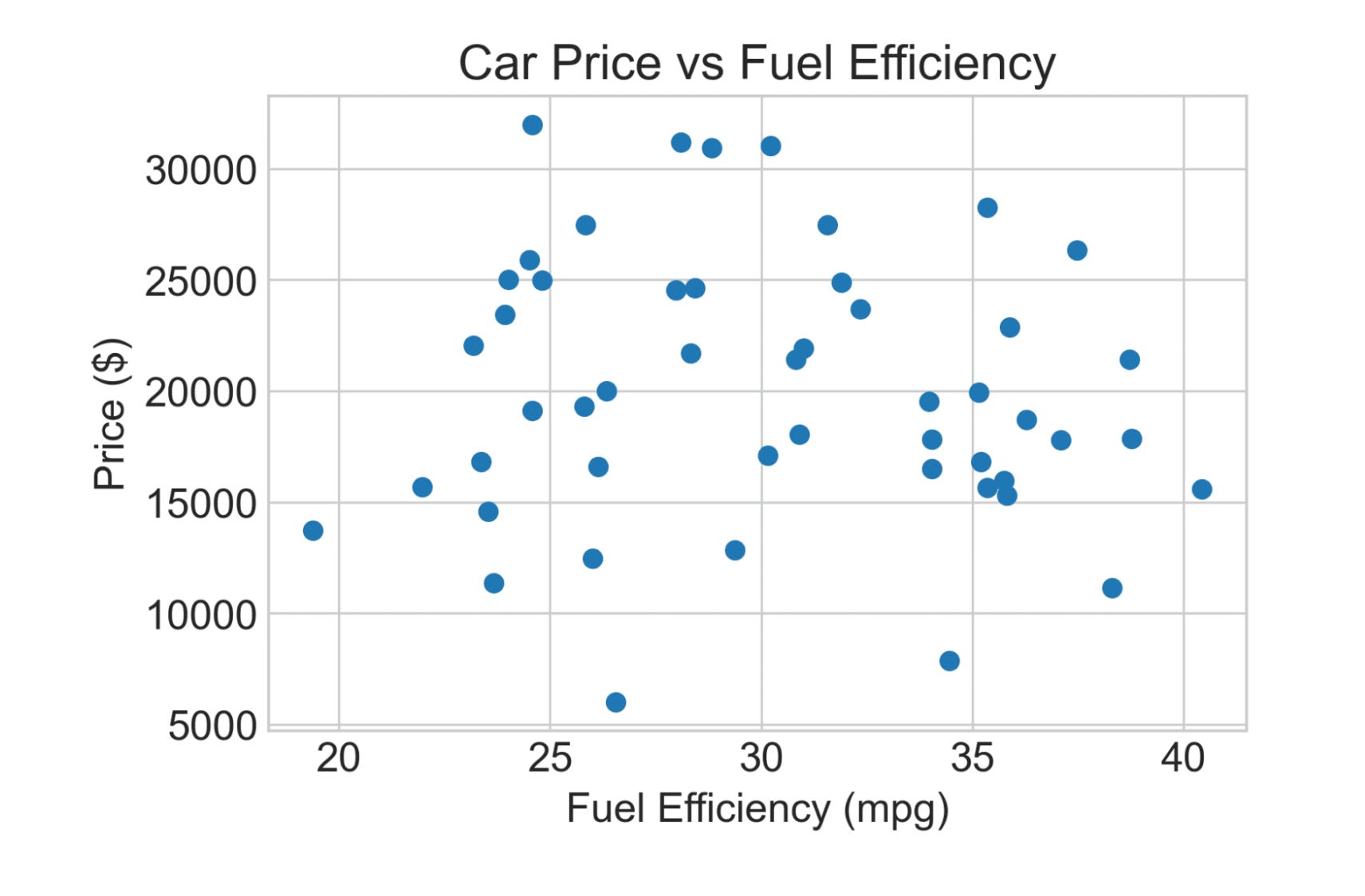
We can go to two dimensions, such as age and weight, and now we’d plot that on a 2D plane, aka x-y axes, aka cartesian plane. Here’s an illustration of the same shape (2 dimensions where each one is a positive real number) using fuel efficiency and price:
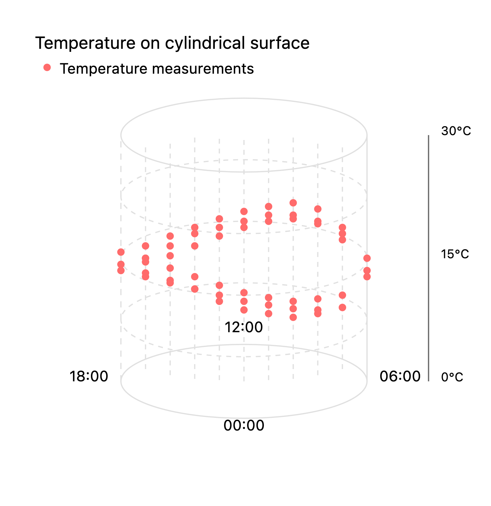
But not all data sets with two values map to a cartesian plane. What if you want to plot the temperature by time of day for February in Chicago. You collect a lot of data points (time_of_day, temperature) and you could plot them on a plane using like minutes_after_midnight as the x-coordinate. But in a very real sense 11:59pm is as close to 12:01 am as 12:01am is to 12:03am and you don’t get that in a Cartesian plane. So you might imagine looping the x-axis around into a circle. Which would give you this:
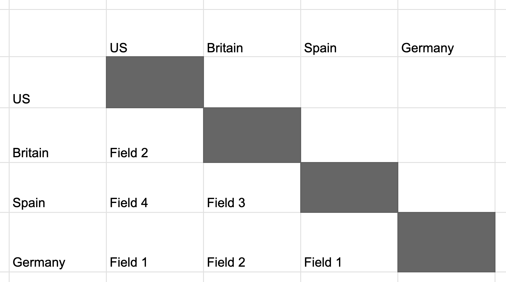
Another way to spice things up is to move from data sets where order matters into ones where order doesn’t matter. Consider all the games in a 4 team round robin where everyone plays everyone else once. If we think about just the games themselves, so like what field the game is played on as opposed to the individual team scores, then order doesn’t matter. The set of all games is the same as choosing an unordered pair of two teams. We end up with this triangle shape, which is like the 2D plane folded onto itself.
The big reveal of the 3Blue1Brown video to me was how to think about the shape we get if we combine the idea of circular data and unordered pairs. What shape (line, cartesian plane, triangle, cylinder) can represent a data set of unordered pairs of points on a circle?
It turns out it’s a möbius strip. To me, this was like the least intuitive thing. Grant had a cool animation with a yellow line and cutting a triangle in half and gluing sides together, but I still couldn’t really visualize it.
I really wanted a clear way to visualize this mapping. On one side you have an unordered pair of points on a circle, on the other you have a point on a möbius strip. And the same way we can derive meaning from lines on a 2D plot, we should be able to derive meaning from lines on this plot.
The first step is finding a real world data set that can be described as two unordered points on a circle. Grant has this youtube short that uses a two-note chord in music:
I think the problem with music notes is that they both are and aren’t circular. If you think about C to G and G to C, in real music a lot of times that would be like C4 to G4 and then G4 to C5 where one of those is a fourth and one is a fifth. So I wanted to find a different example.
I ended up with longitudes. Or if we move from continuous to discrete then time zones. Let’s say you have to pick two cities in the world for offices for your company. There are lots of factors that impact the quality of any given city (population, country, language, weather, culture, etc) but you can also consider qualities of the pairing. There are questions like do these two cities primarily speak the same language or are they in the same country. And you can also characterize their relative longitudes/time zones. Some pairs will be 3 hours apart, others will be 11. I would argue that on this dimension, something like the 5 hour difference from Hawaii to Tokyo has an essential similarity to the 5 hour difference from Chicago to London even though one crosses the international dateline and the other doesn’t.
So I made it. galobius.vercel.app is a javascript app that has a globe on one side and a möbius strip on the other. The globe has two longitude lines that you can drag around and every pair of longitudes maps to a point on the strip. You can also move the dot on the strip and see what pair of longitudes that maps to.
Here’s a video demo (no sound):
Play around without yourself at https://galobius.vercel.app and let me know what you think!